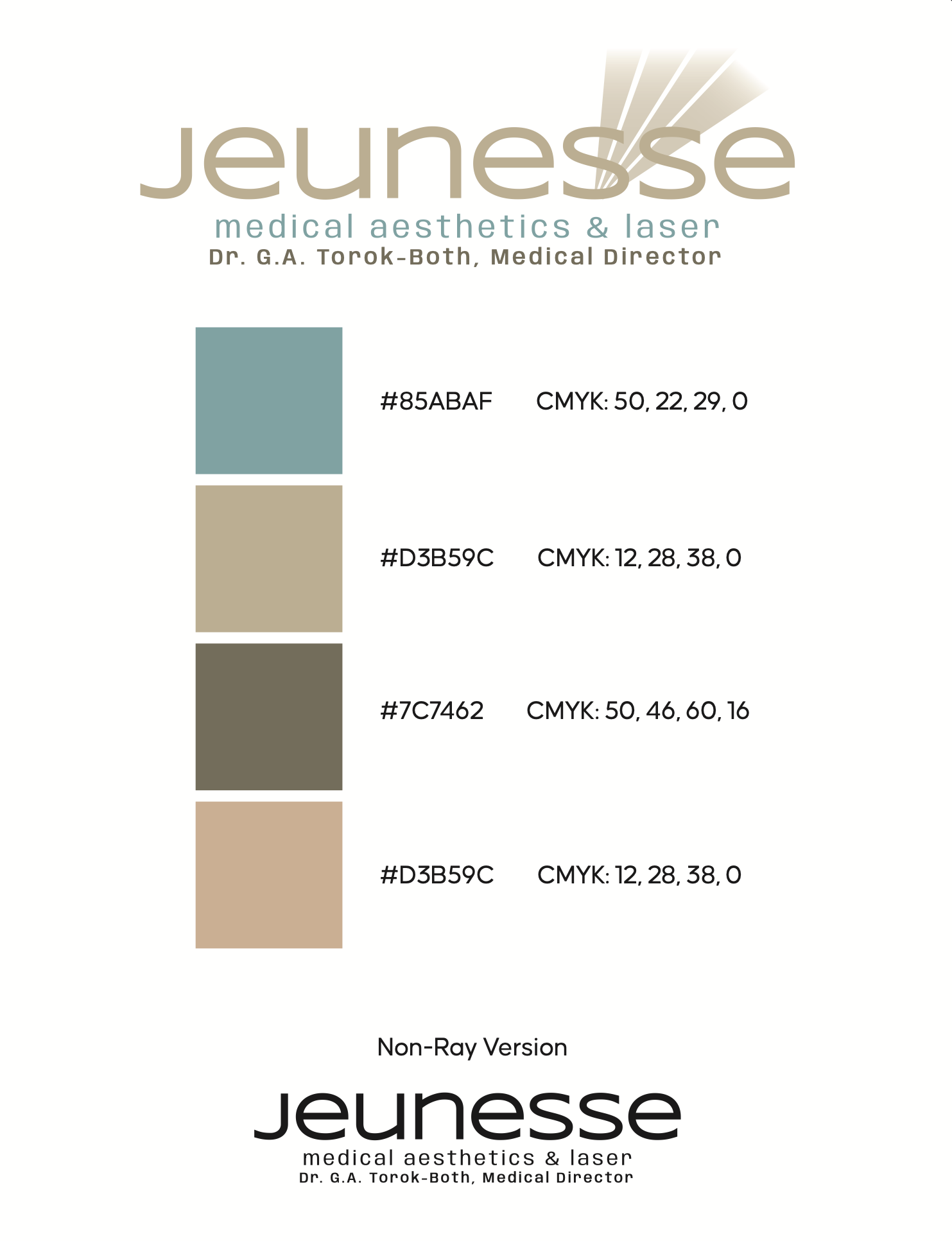
A logo refresh for a medical aesthetics practice. Fast turnaround, considered execution.
The brief was tight — update an existing identity, incorporate a ray motif, and deliver options. No extended discovery process, no brand strategy engagement. Just solid design work turned around quickly for a client who needed it done right under deadline pressure.
The exploration gave the client clear direction across multiple logo variations. The final mark landed where it needed to: clean, restrained, and appropriate for a medical aesthetics environment. The palette — warm taupes, muted sage, and deep olive — reinforces the premium, clinical-yet-approachable positioning of the practice.